
I recently redesigned my website, and wanted to share the process behind it and key things I have learned through running and designing multiple websites over the years.
When I redesigned the site, I did most of the work in a single day, and threw out a professional website design that I spent thousands of dollars on. Here’s why:
- It takes time for a website to “feel” right, and it is really a process of evolution anyway. The thousands I spent on the previous design was a great investment because it forced me to consider key questions. That said, I didn’t want to cling to an old design that didn’t feel right, simply because I spent money on it. I suppose that would be akin to wearing a jacket that no longer fit right, and was no longer your personal style, simply because you spent a lot of money on it years ago.
- I wanted a website that I knew how to modify every aspect of, not relying on hiring a designer for every change I wanted to make. There were specific elements I wanted to change and couldn’t do on my own. I hacked at the old design as much as I could for the past 6 months, making small changes. But it was time for a bigger shift.
- I wanted it to feel personal. Have it feel more immediately that you are connecting with me, not with “a website with content on it.” This is clearly a subjective thing, but overall, I wanted to feature different content and make it more easily accessible.
- I revisited and reworked all key pages, rewriting lots of stuff, and dug into my blog archives to give them a greater presence.
How was I able to do most of the work in a single day? A few reasons:
- I spent a year monitoring and analyzing what I liked and didn’t like about my site, and what I loved from other websites. I spend the last month of every year reviewing these notes and creating a plan of action to better communicate with those I connect with.
- I am leveraging resources that I am familiar with, and provide me power and flexibility in the process, namely: WordPress and Thesis.
- The meager design skills I picked up in 1998 and evolved over the years continue to come in handy. Having a basic working knowledge of Photoshop continues to empower me.
- I leverage the work I did nearly a year earlier with Christina Rosalie. She help me better communicate what my work is about, from messaging and design, including colors and logo. That is the type of work that should make decisions far down the road much easier, and it did. And a side note: when you are trying to craft your OWN messaging, that is a particular time when having a partner in this process is incredibly valuable.
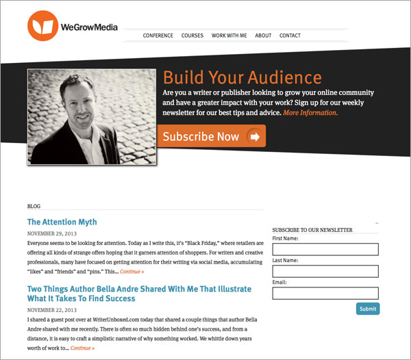
Here is the old website:
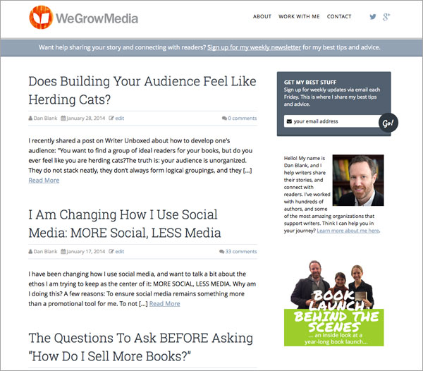
And here is the redesigned website:
I won’t go through design decisions that aren’t useful to you, such as why I go rid of so much black from the old site to focus on orange more. But I do want to share a somewhat random list of advice I think could be useful for you. No, I DO NOT think that your website should look like mine or that mine somehow represents a model. But after working with hundreds of authors, and thousands of websites across my career, these are some thoughts that be of assistance:
- Make key elements of your design unique if you are using an off-the-shelf template or theme. If there is a stock photo of nature that comes with your stock WordPress theme – CHANGE IT. If you are more technically savvy, consider changing fonts or colors or other unspoken ways that the design feels similar to, but separate from other sites out there.
- For the main navigation: make it as sparse as possible. For many authors this could me: ABOUT, BOOKS, and CONTACT. As my business has grown, I have cut BACK on navigation. It used to be more than 5 choices, now it is 3. This seems to be counterintuitive – but I find that the paradox of choice is at play here. Too many options results in zero action.
- As for page depth – how many clicks someone has to take to find something, try to keep it to no more than 2 clicks. For instance, don’t expect that someone will click: BOOKS –> FICTION —> SCIENCE FICTION —> RECENT WORK. After taking one click, engagement drops off dramatically.
- Remove speedbumps… make social media icons easy to find, as well as your newsletter sign up. For me, I put social media icons on the top, and finally streamlined my newsletter sign up process – removing the need to provide your name in the registration box.
- Make hard choices about social media – while I have accounts on all the primary social media channels, I chose only two to feature on my website. Why? Because it tells people where I am truly active. This decision is not set in stone either, already in the past month I am realizing I am way more active on Instagram and Facebook nowadays than Google+, so this will evolve.
- Ensure key messaging is updated. In this case, I had a photographer take a new headshot (a process within itself!) and redid my bio, and many elements of how I describe my work. I find that (much like a LinkedIn profile), people tend to “set it and forget it” – and end up with messaging that is years old, and somewhat out of date. Not incorrect, per se, just not the exact words they would use describe themselves today.
- Feature things that FEEL right – the whole “show don’t tell” thing. Instead of me making a huge deal about TELLING what it is that I do, I created sidebar images to feature some of the older blog posts I particularly liked. In the screenshot above, you can see that on the bottom right of the sidebar, where I call out the “Book Launch Behind the Scenes” blog post.
- Please make backups to your blog and website automatic. There are plugins for this in WordPress. Your blog will get hacked, or a meltdown will happen when you least expect it.
WHY DESIGN MATTERS, AND WHAT IT REALLY IS
Design is not about adding, but honing. And for an author or creative professional, this is about focusing on a singular identity that best communicates to your ideal audience.
Design is not about wearing fancy new clothes, but rather: giving yourself – AND THE WORLD – a better lens by which to see you. It should feel more honest, more clear, and without all the muck that gets in the way.
Often there is a philosophy underlying thoughtful design. For myself, I create a yearly “brand book” for WeGrowMedia, and last year I took the step to hire someone to help me better understand and more clearly communicate what my company is about. To this day, I still take actions based on the work we did together. Overall, I wanted things to be more personal and more experiential.
There were other results of this process, such as how I am changing how I use social media.
The real purpose of design is function – to remove any element or feature that could get in the way of a specific function. Often, it is less, not more. Cutting away. Questioning every tiny element. Apple is famous for popularizing this – they have pride that there are very few visible screws on any of their products, for instance.
Too often, people ADD more with a vague hope that something will work, that something will engage a reader. So they make the navigation crowded, add more to long sidebars of content, and use more and more adjectives to describe who they are and what they do.
Another small action I took was to try to use FEWER characters for my Twitter bio. I often see folks try to shove as much as they can into those 160 characters. For myself, my goal is to communicate better with fewer words. This is what I have now: “I help writers share their stories, and connect with readers.” which is much shorter than what I had before and leaves 61 characters unused.
This is akin to breathing room, to white space.
Designing a website is difficult because too often, we are trying to either:
- Make ourselves sound bigger than we are
- Represent the complexity of a multifaceted individual completely
For me, a new round of online classes have just started, I am working with more than three dozen writers at the moment, and for most of them, they are trying to find an authentic way to express their work, while not being overwhelmed in the process. As one write put it: this is about “helping writers be human in public.”
Does my new website design feel PERFECT for me? Nope. But it feels like a step in the right direction. One that focuses more on who I am, who I work with, and the body of work I have slowly created over the years via the blog. It seems like it honors the right things a tiny bit more than the last design.
And for the next year, I will continue to analyze this – what feels right, and what needs to evolve, and I will try to take one more step in the right direction.
What has your experience been with designing your website, in how you try to communicate your voice through design?
Thanks.
-Dan