
I just launched a new design of my website, and wanted to take you through the process with the hope that it may answer any questions you have about how to approach a project like this.
Why Redesign Your Website
We always have to start with the goals, perhaps by answering the question: why bother spending the time and money to redesign your website?! Yesterday, I talked about the need to differentiate yourself in order to really build your brand. For years, I relied on free website themes and templates for my websites, and I am a huge advocate for this – it’s a great way to jump into the pool and focus on things that matter most: identifying your purpose, developing great content, and connecting with others.
But… sometimes a template is limiting. You look like everyone else. You find yourself making strategic decisions based on what the template allows you to do, not what you would do if you really had the freedom to create exactly what you wanted.
For me, 2012 is about new partnerships and scaling my business. About really honing what it is that I do. My website is a PRIMARY way I connect with the world. It needs to reflect exactly what I am about and encourage others to connect with me. I was ready to make an investment to not have my web presence consist of a cobbled together mix of free components. That I would invest in doing things right.
For many – that is a hard decision. We live in a culture where we expect most things on the web to be free. We only buy physical goods when they are on sale at the store. Choosing to spend hundreds or thousands on a website seems absurd to many. It’s like paying to use Facebook or paying to see the sunset. Professionals add insight and experience that enhance what you are building. Tomorrow I will talk a bit more about the value of hiring professionals.
How to Find a Web Designer
To find a web designer, I wanted to work with someone who was starting a small business as I had. Someone I could build a long-term relationship with so that I had someone I trusted I could always work with, and help them drive their business forward.
I spent time paying attention to websites I really liked. Sometimes the website had the designers name on it, other times I would ask who designed it. I reached out to a few people to get a sense of pricing, of availability and process. This part of the process is scary for three reasons:
- Price. You see all kinds of advice online as to how much you should spend on a website.
- You don’t know what you will get. Even if you like someone’s work overall, you will clearly get something unique.
- You need to align to someone else’s process. Sometimes this can be a very regimented process, with issues and processes that are new to you.
I suppose it’s like going to a new hair stylist in the big city to have something drastic done. You wonder why it costs so much, and worry what you will look like once they are done with you!
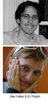 One of the people I spoke to was a former colleague from my old job, KJ Parish. I knew she had gone out on her own to provide web design services, and she had been super helpful on some small issues earlier in the year. (also, she plays in a band, which I think is cool) She has joined Spruce Solutions to provide not just web design services, but full development as well. So I began speaking with KJ and Ben Heller of Spruce about my project.
Why did I end up choosing them? A few reasons:
- They didn’t hesitate to get on a Skype chat with me. They didn’t send me a requirements document or some long legal agreement to sign that outlined that I can only email them X number of times per month. They were open to listening. Yes, we had very clear parameters to our working relationship, it was very professional. But it allowed room to work TOGETHER and ensure we could develop something special.
- They both knew their chops. It was clear not just on their resumes, but in conversation, that they knew the right questions to ask, and were nimble and knowledgeable in how they answered my questions.
- Having TWO experts on my team really meant the world to me. An expert developer (Ben) and an expert designer (KJ) – I knew that the experience between the two of them would benefit me in 1,000 ways during this experience.
Something about Ben and KJ felt right. So for me, the answer was clear. When you are searching for a web designer, go with someone that feels right. Don’t just convince yourself by a list of skills or promises. You have to work WITH these people, it’s not the same as buying a washing machine.
We negotiated on timeframe, deliverables, price. We came to a place where everything seemed to work for everyone. Part of this process is respecting the value that the developer/designer provides. Again, this should be looked at as a partnership, as members of the same team.
Knowing What You Want
To best communicate what I wanted, I spent a couple of weeks putting together a 40+ page design inspiration book. Here I included the following:
- My goals – make this overt, don’t assume the designer knows what you want! For me, I wanted a site that was very focused on a few things. I wanted to remove every pixel that wasn’t absolutely essential.
- Screenshots of sites I liked, and made notes of what I liked about them. Things such as white space, or font size.
- Concerns – I directly stated things that I was most concerned about. Again, never assume. I shared screenshots of sites that I DIDN’T want mine to look like. There is a fine line between site that is bold and focused, and one that doesn’t communicate well.
- Colors, tone and style – what I wanted the site to convey and examples of how I was thinking about it.
- A wireframe of the homepage. I went into Adobe Illustrator and created a REALLY basic layout of what I thought the homepage needed to have on it. Looking back on it right now, it’s neat to see how Ben and KJ took that wireframe and made it SO MUCH better.
- Thoughts on logo design. This was another thing they were doing for me. I shared examples of logos I really liked, talked about the term “We Grow Media” and which words were most important and why.
- I reviewed key elements of the interior pages of the site such as About Us, Speaking, etc. Again – I shared lots of screenshots and notes.
As you look through the inspiration book, you see the same words pop up again and again. “Bold” is one of those words. I provided this document to Ben & KJ and we then addressed any remaining questions.
Logo Design
![]() We started off with the logo design, figuring this would set the tone for everything else. I made the decision to move away from foilage (due to the word “grow.”) There are so many other logos out there that use a small sprout within it, very similar to what I had been using up until now. While the metaphor of a plant growing is apt to what I do, the visual wasn’t necessary.
We started off with the logo design, figuring this would set the tone for everything else. I made the decision to move away from foilage (due to the word “grow.”) There are so many other logos out there that use a small sprout within it, very similar to what I had been using up until now. While the metaphor of a plant growing is apt to what I do, the visual wasn’t necessary.
We quickly came to agreement on the letterface and balance of the words, but the graphic to accompany it took longer. A number of images/styles were presented, and one really jumped out at me. We went through multiple versions of it, getting closer and closer to a graphic that I felt told a story.
But… we hit a speedbump. Just before I was going to finalize it, I found another company using a similar graphic. I didn’t feel comfortable with that – simply out of respect for that company – so we began making modifications to it. Honestly, this was the hardest part of the entire process because I felt the pressure to represent everything about what We Grow Media is in a simple graphic.
As we got closer to deadline, I made a big decision: kill the graphic. It was good, but I didn’t have a 100% feeling behind it, and didn’t want to get the rest of our design process off track because of it. Sometimes you have to remove something in order to move forward; in this case, it was the graphic in the logo. I like what we came up with for the typeface – simple and clean, with a nice balance of the words.
Making Hard Decisions
 For the website design, Ben & KJ provided five initial designs – really to establish the mood and pallete. This is a critical part of the process, where we take things from what “could be” to what it “will be.” These are two different things – you have to make hard decisions quickly.
One design jumped out at me as much bolder than the others, and we quickly went down that road. What followed were a series of refinements. At each step, I tried to be conscious of getting what I wanted, but respecting their time. Too many web design projects get caught with endless noodling: asking too many questions, always adding one more request to the list.
One thing I learned in the process was to be careful to not change too many things at once. There is a temptation to “fix” so many other things in the site. For example: do I change my email newsletter sign up from from three input fields to just one? Do I transition away from using Disqus for blog comments? The issue here is that with each additional thing you change, you exponentially increase the chance of something going wrong, and of delaying launch. In the end, the process forced me to analyze every page, and make hard decisions – and we launched on time with a site I am super proud of.
The End Result
What I ended up with is the design you see now, but there is so much more. The entire thing was built from the ground up in html 5, and is a completely custom WordPress install. This isn’t a modified template. The backend of the website, where I manage all the content, has these special areas that make it easy for me to update different sections of the site, such as the big featured box on the homepage, the services boxes beneath it, and various sidebars for interior pages. They sent over a nine page user guide with step-by-step instructions on how to manage it all.
It really blew me away how much more powerful that made the site for me. Thanks so much to Ben and KJ of for their amazing work!
-Dan